Hoghton Mifflin & Company, Boston-based publishing firm.
The history of Houghton, Mifflin & Company goes back to mid-nineteenth century, when Henry Oscar Houghton bought into a prominent Boston printing firm, eventually relocating it on the Charles River and renaming it Riverside Press. George Harrison Mifflin became a partner in 1872, by which time the firm had entered publishing without much success. Various mergers ensued and in 1880, under the weight of considerable debt, the two men restructured their business to form Houghton, Mifflin & Company. In 1882, they established an educational department and inaugurated the Riverside Literature Series, which published American classics with study guides for schools. Despite a spotty track record with literature, by 1921 Houghton Mifflin was the fourth largest educational publisher in the U.S. In the 1950s, after steady growth in their educational books division and the acquisition of related educational testing enterprises they were going very strong indeed.
In August 1954, Ismar David showed his portfolio to Connie Coyle at the offices of Houghton Mifflin Company in Boston and, at her suggestion, mailed her photostats of his work two weeks later. However, it was not until 1957 that he received his first commission from the firm. His assignment: J.B., a modern retelling of The Book of Job by poet Archibald MacLeish.
Houghton Mifflin was in a hurry and David made sketches for the jacket, endpapers and title page while on vacation in Rockport. Katharine R. “Jimmy” Bernard reiterated her instructions in a letter, sent to David in care of the Masons: “…we want some rough sketches of ideas for an endpaper decoration and a title page…The designs should avoid being either too biblical or too poetic.”1 The sketches were approved on July 22, with changes requested for the endpapers: “The endpaper was also approved of, with the exception of the background, which looks more like the biblical background than “J.B.”’s circus tent. We thought that by eliminating the distant city and mountains and the bushes in the foreground, leaving merely the lines running horizontally across the pages, it could be made applicable to both the biblical and the book settings.”2 David met Bernard in Boston the following Friday, July 26th, and was able to send the finished work on August 3. Ironically, after the initial rush to get the artwork done, publication was delayed because of extensive author’s alterations.
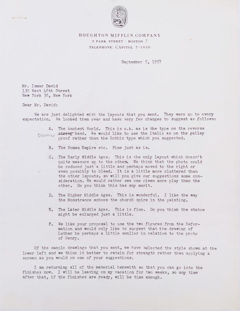
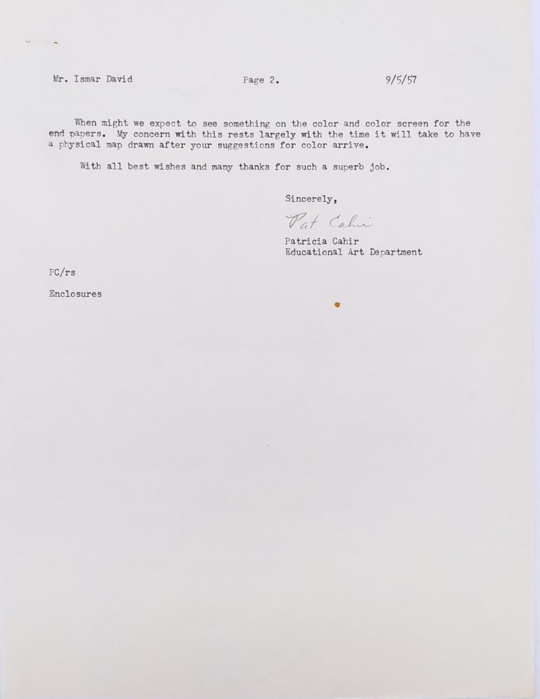
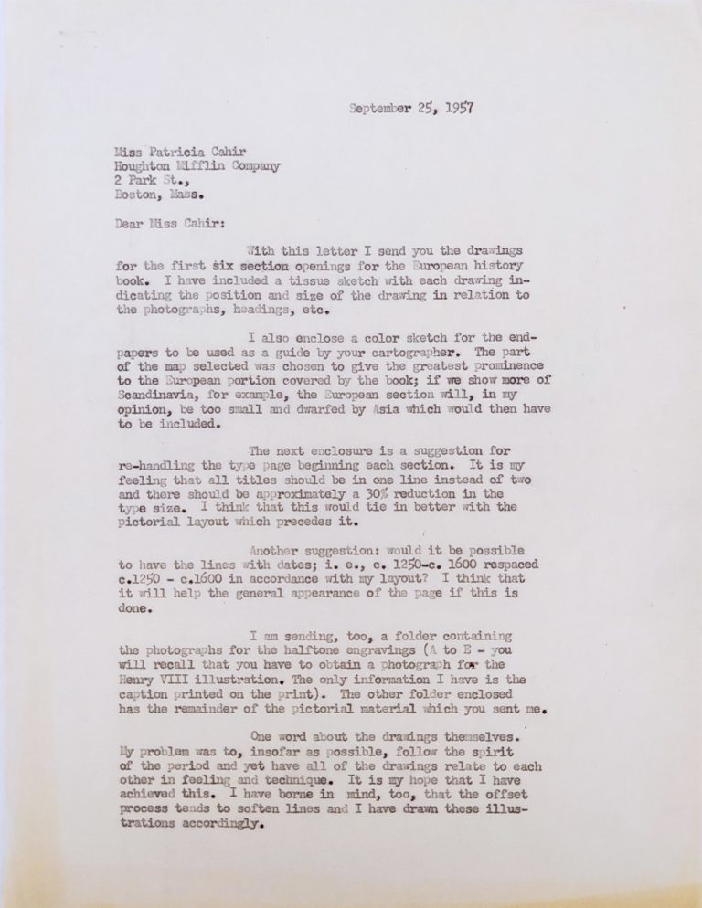
At the same time, David had begun a new project for Houghton Mifflin, the third edition of A Survey of European Civilization, for which he would design a cover and thirteen complicated chapter openings, combining his own line drawings, photographs and text. The job necessitated research and leg work on David’s part, including visits to the New York Public Library picture collection and the United Nations in search of source material, and even found him negotiating picture rights with a photographer, whose office was one block away from his in midtown Manhattan. David worked well with Patricia Cahir in the Educational Art Department and her colleague, editor Henry F. Thoma, who became her husband later that year. Their business correspondence is frank, but written with warmth, respect and mutual admiration. Hortense Mendel typed the letters on her husband’s behalf and lent them a fair amount of her effervescent style. David enjoyed working on the project. He sent Pat Thoma four examples of different treatments or techniques, including two using scratchboard, for consideration. About the finished drawings, he wrote: “My problem was to, insofar as possible, follow the spirit of the period and yet have all of the drawings relate to each other in feeling and technique. … I have borne in mind, too, that the offset process tends to soften lines and I have drawn these illustrations accordingly.”3
In early 1958, as work continued on European Civilization, J.B. finally appeared. Everyone was pleased with the result. In addition there was “great enthusiasm” and an “enormous amount of excitement stirred up here [in New York] about the book itself.”4 (J.B. won a Pulitzer Prize for drama in 1959.) The Davids were very keen on getting extra proofs of the illustration for the endpaper because “a number of people have asked us for proofs for their files” and “Ismar would also have liked to show it in some exhibitions in which he is being included.”5 Jimmy Bernard did her best to help. In the end, the Davids got the cut from Houghton Mifflin and had the illustration printed on rice paper, giving it to friends and colleagues, Paul Standard, Mort and Millie Goldsholl and Pat and Henry Thoma, among them.
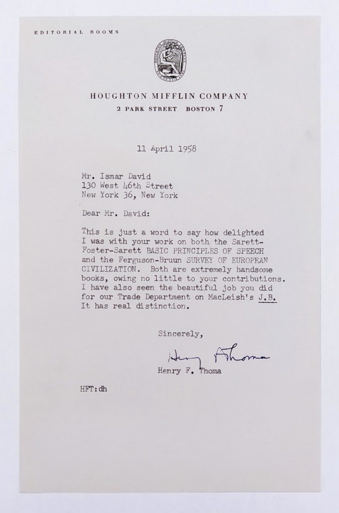
David again worked with the Thomas on cover and endpapers for Basic Principles of Speech. The initial cover sketch was rejected, “The cover has not come off so well unfortunately. Almost everybody agreed it might be wiser to omit the impression of the lips.”6 An abstract design (minus anatomical references) proved an acceptable and dynamic solution, along with the endpapers, a montage of famous speakers and the authors’ seven basic principles. In late spring 1958, Henry Thoma wrote to David:
Dear Mr. David:
This is just a word to say how delighted I was with your work on both the Sarrett-Foster-Sarett BASIC PRICIPLES OF SPEECH and the Ferguson-Bruun SURVEY OF EUROPEAN CIVILIZATION. Both are extremely handsome books, owing no little to your contributions. I have also seen the beautiful job you did for our Trade Department on MacLeish’s J.B. It has real distinction.
Sincerely,
Henry F. Thoma
David received more commissions from Houghton Mifflin: A History of Art (1959), Children’s Anthology of Literature (1959), illustrated by Fritz Eichenberg; The Changing Soviet School (1960), Introduction to Religious Philosophy (1959), Novels in the Making (1961), Poems in the Making (1963), Theatre and Drama in the Making (1964), series design for Riverside Editions; and series design for Riverside Studies in Literature—which, temporarily at least, used one of David’s Photo-Lettering alphabets. But those first three projects came at a significant time in his career, when he was trying to establish himself in the United States. They showed the variety he was capable of and the enthusiasm and intensity with which he approached his work. Finally, the J.B. endpaper and its reception may represent a breakthrough of sorts in the development of his linear style.
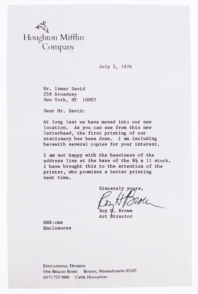
In February of 1974, David was pleasantly surprised to receive a check for the re-use of his signet for Riverside Books. Art director Roy H. Brown wrote on February 12th: “The device that you designed about ten years ago for the Riverside Editions holds up well, so much so, in fact, that we plan to use it further. Of the various devices that have served to identify the Company over the years, yours seems to capture the combination of tradition and modernity that we are seeking.”
