Robert Lincoln Leslie, 1885–1987, founder (with Sol Cantor) of The Composing Room, instrumental in getting David Hebrew to Intertype.
Trained as a medical doctor, Robert Leslie changed course in 1920, co-founding The Composing Room in 1927.
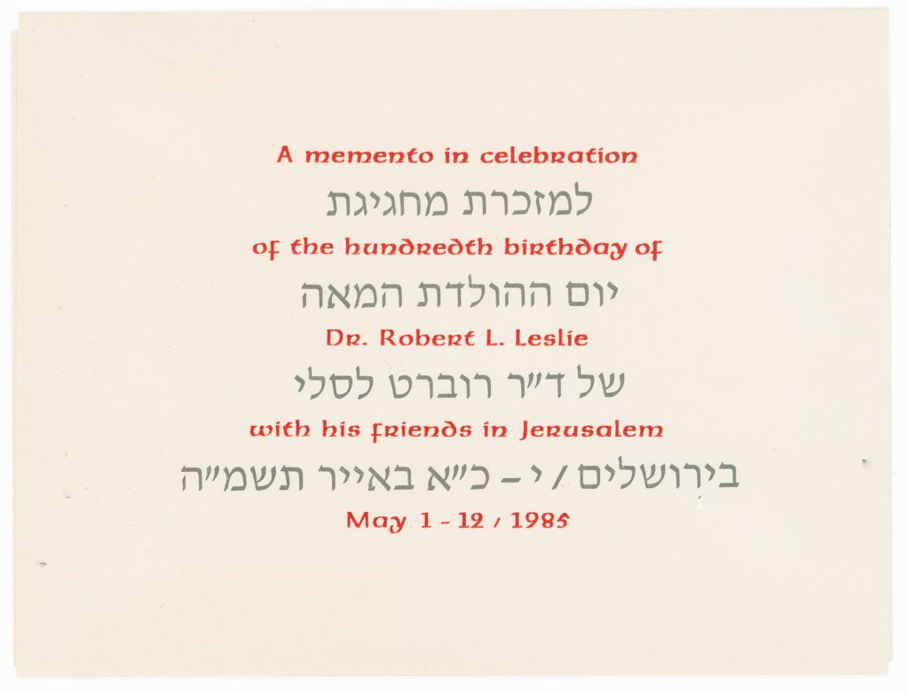
Robert Lincoln Leslie, 1885–1987, founder (with Sol Cantor) of The Composing Room, instrumental in getting David Hebrew to Intertype.
Trained as a medical doctor, Robert Leslie changed course in 1920, co-founding The Composing Room in 1927.

Zniman Vitamin Enriched Rusks, client (Israel).
As the package affirms:
The ideal food for babies and children,
digestible and nourishing for the sick and convalescent,
delicious and healthy for everyone!
Wronker, Lili Cassel, 1924–2019, calligrapher and illustrator.
Born in Berlin, schooled partly in England, Lili Cassel emigrated as a teenager to the United States with her sister and parents. She was a freelance calligrapher and illustrator. Her husband, Erich Wronker worked as a printer at the United Nations. They had two printing presses in their home and collaborated on various printing projects. Printers Clarke & Way gave the Wronkers the metal sorts of David Hebrew that had been cast for Ismar David’s contribution to Liber Librorum, 1955.
In 1949, Lili Wronker, then something of a protégé of Robert Leslie, traveled to Israel. One of the people she met there was Ismar David, who wrote, in an undated letter to Leslie: “From Lilly [sic] I have to tell you that we like her as well as her work very much.”
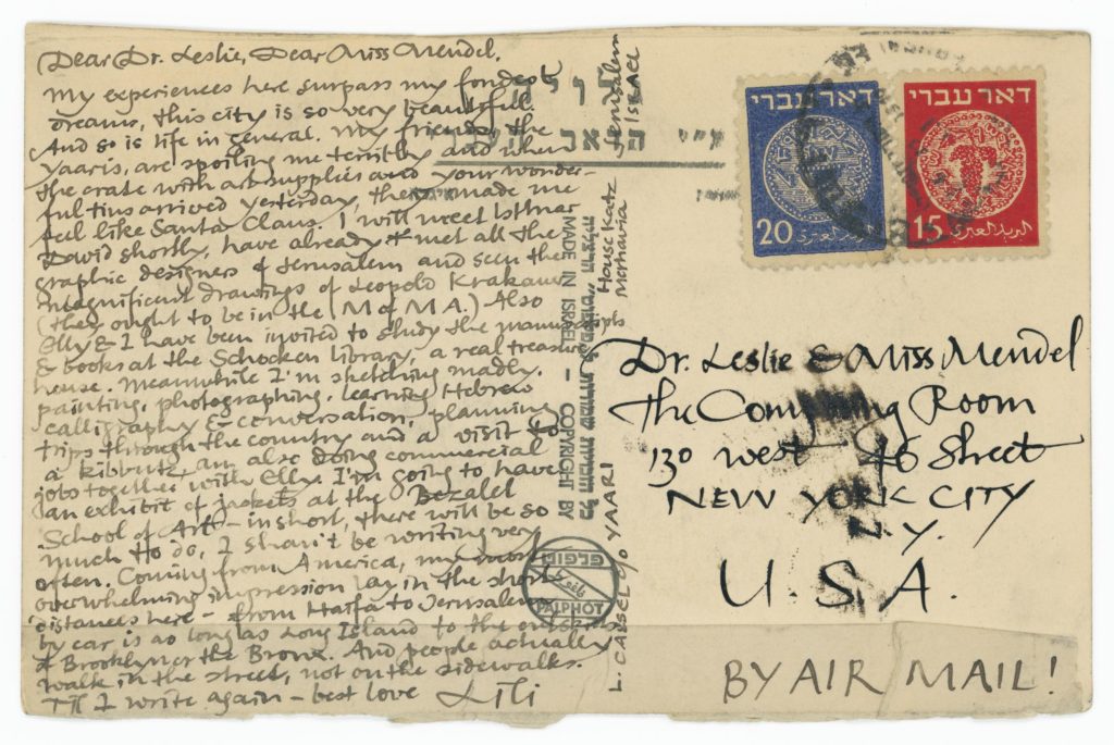
Dear Dr. Leslie, Dear Miss Mendel,
My experiences here surpass my fondest dreams, this city is so very beautiful. And so is life in general. My friends, the Yaaris, are spoiling me terribly and when the crate with art supplies and your wonderful tins arrived yesterday, they made me feel like Santa Claus. I will meet Istmar [sic] David shortly, have already met all the graphic designers of Jerusalem and seen the magnificent drawings of Leopold Krakauer (they ought to be in the M of MA.) Also Elly & I have been invited to study the manuscripts & books at the Schocken Library, a real treasure house. Meanwhile I’m sketching madly, painting, photographing, learning Hebrew calligraphy & conversation, planning trips through the country and a visit to a kibbutz, am also doing commercial jobs together with Elly. I’m going to have an exhibit of jackets at the Bezalel School of Art–in short, there will be so much to do, I shan’t be writing very often. Coming from America, my most overwhelming impression lay in the short distances here—from Haifa to Jerusalem by car is as long as Long Island to the outskirts of Brooklyn or the Bronx. And people actually walk in the street, not on the sidewalks.
Til I write again—best love Lili
Kelvin J. Arden, 1912–2012, pioneer in the field of College and University Publications, member AIGA and Typophiles.
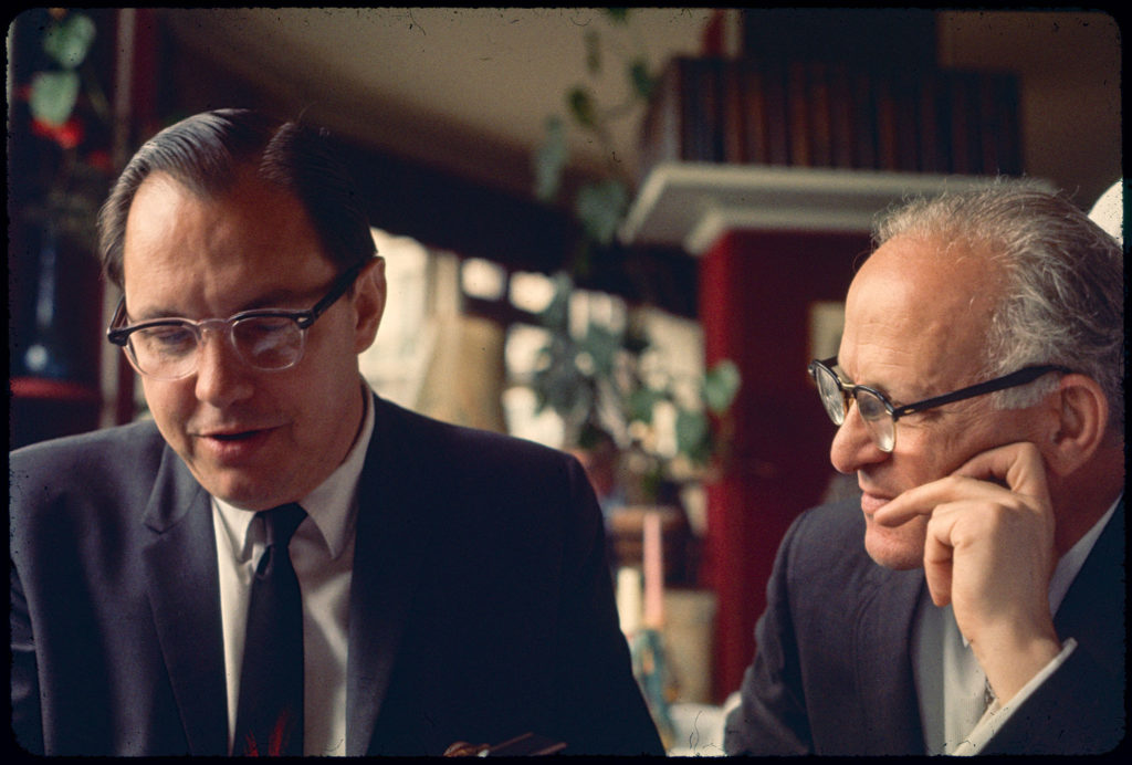
Kelvin Arden established the publication departments in both New York University and Cornell. He was a member of the Typophiles, the Type Directors Club, the AIGA and the American Printing History Association. A fuller portrait can be found here.
A birthday tribute from Ismar David, detailing a joint project from Eretz Israel.
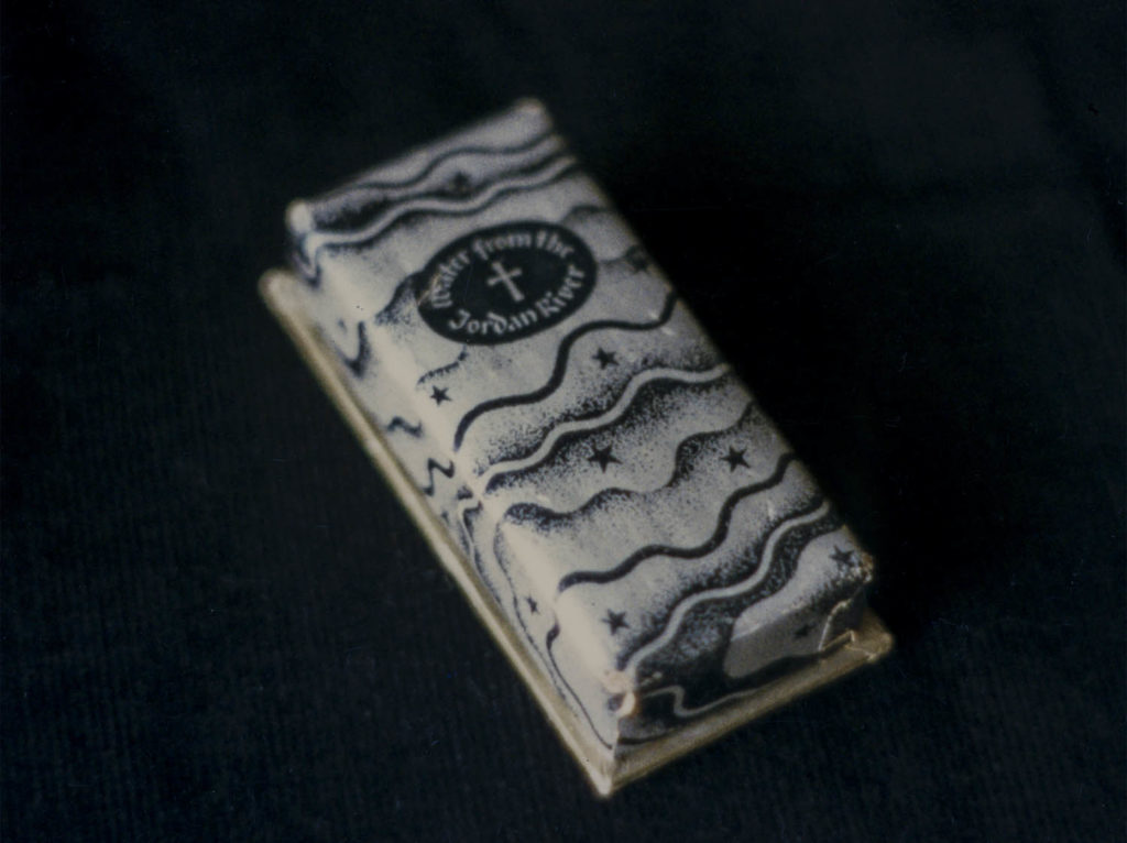
In the Promised Land (so named because it is the land of promises, made, kept and broken, lived the young upright man Helios the image-maker with his family. He had settled in the land in which milk and honey flow, but his share in these blessings was meager.
To improve his lot, he took stock of his assets and decided to use his ingenious craft of image-making. Thus he would exchange images (printed ones, of course) for dough, the kind of dough that would buy some amenities and [the] additional milk and honey needed to sustain a family. He was assisted in his endeavor by another image maker of lifetime experience, who was steeped in the traditions of the land of promises and knew when to make and how to break them.
It was then that other promising chances appeared on the horizon. A man, who as organizer of caravans had contact with the outside world, had a great vision. He noticed that it was not only milk and honey that flowed through the land, but also the Jordan River and remembering that the Promised Land was also the Holy Land, he saw the Christian world craving for a symbol of the land’s holiness and himself stilling this craving by distributing minute quantities of the Jordan’s water [among] them. Needless to say that he saw himself already richly rewarded for his humanitarian act. To convert this vision into reality he sought out Helios the image-maker to create an image of holiness containing visibly the drop of holy water. The caravan organizer sounded convincing, but he did not rely on his power of persuasion. He rather suggested that a scroll of certification signed by the High Priest be attached to each packaged drop to put the minds of millions, who would behold the drop of holiness, at ease.
Here was a challenge for the image-maker. The water, he thought, should be contained in a vial. The vial should be set in wood that would protect it, but still allow the precious drop to be visible. A ribbon attached to the wood would make it wearable as an amulet and a scroll would guaranty its authenticity. All this would be in a box available for a few piasters a piece. But remember the millions waiting for the chance to own this unique certified talisman. Perhaps the simplest thing to produce was the box that was to contain the amulet and scroll. The scroll was a different matter. It was easily designed and printed, but after the high priest had signed the first 50 certificates, he had second thoughts and threatened to withhold further signatures. The wooden container, after trial and error, was satisfactory, but the vial of the small size needed became a problem for which the final solution was a section of glass tubing sealed with wax at both ends. Alas, the holy water evaporated before it reached the waiting millions. The end of a vision.
The image maker’s wife was well as the writer of these lines functioned as assistants. Names are changes so that the writer cannot be held responsible for distorting facts. I remember with affection other events and deeds of the same period, especially the image-maker’s generous and invaluable help and support for my project, the design of contemporary Hebrew letters for printing.
With my and Dorothy’s best wishes for many happy returns.
A short memorial address by Ismar David about George Salter, 1897–1967, graphic designer, colleague and friend.
Today we are meeting here to evoke the presence of a great teacher who, by giving of himself so much to his students, has helped to establish the outstanding reputation which Cooper Union enjoyed during the decades of his teaching. George Salter’s concern for each individual student was not only professionally motivated but of [a] deep human nature. His personal, as well as his artistic integrity, touched everyone who was privileged to know him.
He has influenced my life when he recommended me as instructor for calligraphy in the year 1954. I am still grateful for his trust in me while I was a newcomer to this country with limited experience as an instructor. He was one of those artists who seem to remain young while continuously developing. The work of his later years truly impressed me as it seemed to deepen and to reveal his unique and humane personality to a higher degree than his earlier work that I had known.
His reward are those students who have made over the years a name for themselves and through their own work continue a tradition that George had started and thus his spirit remains with us.
AIGA, the oldest and largest professional membership organization for design.
Founded in 1914, the AIGA has more than 70 chapters and more than 18,000 members. The organization works to advance design as a professional craft, strategic advantage, and vital cultural force.
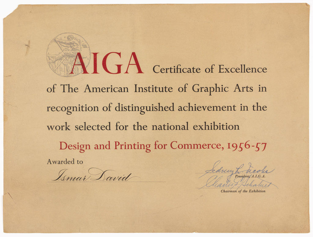
Ismar David was a member of the organization. He was on the jury of an AIGA exhibition, Paperbacks, USA, covers from 1957-59, along with Louis Dorfsman, Albert Dorne, Raymond B. Dowden, Robert Gage and Theodore Willentz. 1“AD News: AIGA’s PforC show deadline Jan. 15,” Art Direction: The Magazine of Creative Advertising, January, 1960, p.62. In 1973, The Psalms, which he designed and illustrated, was chosen for “Fifty Books of the Year” and in 1974 The AIGA Gallery in NYC exhibited his work.
Ernst Reichl, 1900–1980, book designer, typographer.
Born in Leipzig, Ernst Reichl was already a book designer when he emigrated to the United States in 1926. He held a Ph.D from the University of Leipzig, designed thousands of books and taught at New York University. He was active in the American Institute of Graphic Arts, the Type Directors Club and the Typophiles. He shared office space with Ismar David for a while and they had a joint exhibition at AIGA in 1974.
John Begg introduced a tribute to the work of Ernst Reichl published by the Gallery 303, Heritage of the Graphic Arts.
Ernst Reichl has designed more than 2000 books—on numerous subjects and for many publishers.
I believe there is evidence in all of his work of a readiness to depart from tradition when the occasion seems to demand such choice.For example, by tradition, the title of a book is on a righ-hand page. But where a pair of pages can be encompassed by one glance, as in a book, this right-hand placement can hardly be called preferred, or significant. With a half title occupying the first page, as is now customary, we open the title spread to a wide entrance into the book, and the whole area may well be considerd one graphic unit.
This concept of the title page as a double spread has been developed by Ernst Reichl in many different ways: fifteen examples are shown here.
Edward Rondthaler, 1905–2009, typographer, founder of Photo-Lettering, Inc., chairman of the American Literacy Council, proponent of simplified spelling.
Ed Rondthaler’s life-changing moment came at five-years-of-age when his uncle Bob gave him a toy printing press with rubber letters. His parents presented him with a 3 x 5 Kelsey Press (and an assortment of old metal type) for Christmas when he was ten. There was, as they say, no turning back.
After college, Rondthaler moved to New York and began a series of jobs in printing firms, gaining experience in a fantastic array of printing techniques. In 1932 he found his dream machine at the Rutherford Machine Company: a not-quite-successful step and repeat device originally intended to facilitate the printing of elaborate backgrounds for banknotes. Through ingenuity and perseverance, Rondthaler and his colleague Harold Horman developed and perfected a machine that used photographic technology to compose type. After a few years of failing to sell machines to other typesetters, they launched their own typographic service company. Photo-Lettering entered the lexicon. Creating typefaces on film reduced production costs of manufacturing and increased flexibility for clients, who only needed to telephone in specifications in order for expert compositors to set their headlines. It’s impossible to imagine the advertising of this period without Photo-Lettering. Rondthaler went on, with Aaron Burns and Herb Lubalin, to found the International Typeface Corporation in 1970, another dominant force in the industry and one of the world’s first type foundries with no prior connection to metal type casting.
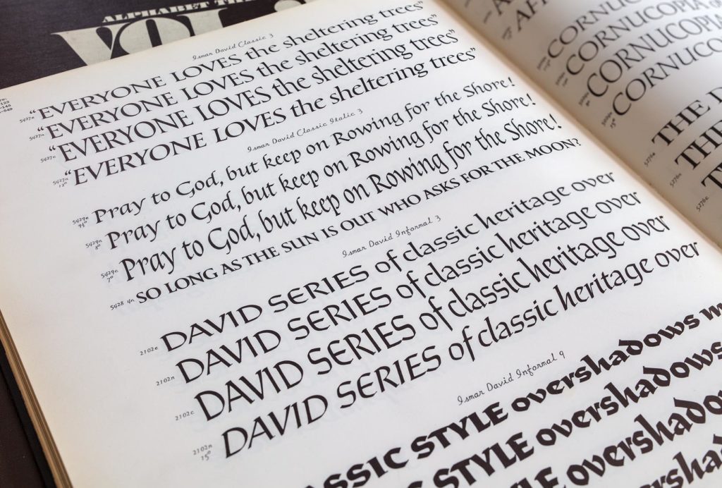
In 1981, Rondthaler published his book, Life with Letters–As They Turned Photogenic (Hastings House, New York). In it, he mentions working with many calligraphers, including Ismar David, Jeanyee Wong, Bob Boyajian and Paul Standard. Photo-Lettering published these David typefaces: Informal, Classic, Inscripta and Siddur.
Just before New Year in 1988, Rondthaler sent a note to David. (Note: The 83-year-old Rondthaler still had almost another 21 years ahead of him.)
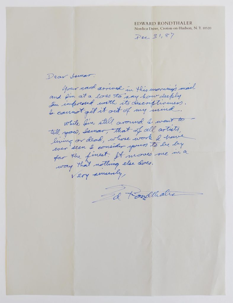
Dec 31, [19]87
Dear Ismar:
Your card arrived in this morning’s mail and I’m at a loss to say how deeply I’m impressed with its descriptiveness. I cannot get it out of my mind.While I’m still around I want to tell you, Ismar, that of all artists living or dead, whose work I have ever seen I consider yours to be by far the finest. It moves me in a way that nothing else does.
Very sincerely,
Ed Rondthaler
Harold Yardlan, 1922–2004, owner of Geyer Studio, a calligraphy studio in New York.
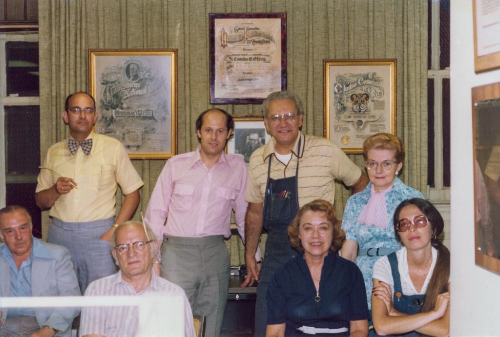
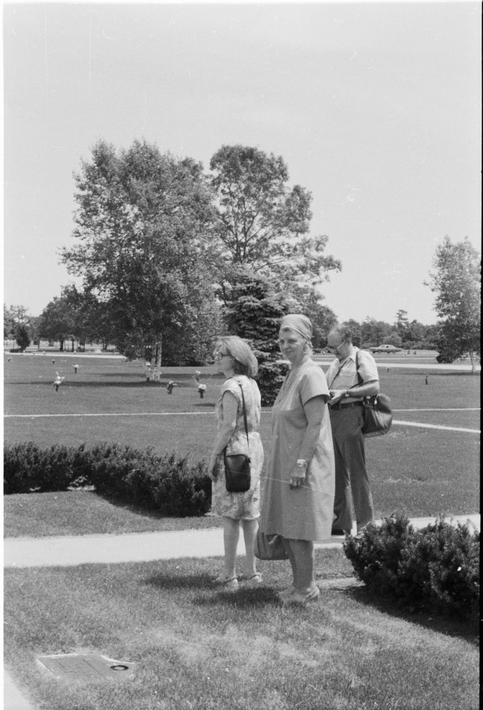
Harold Yardlan began working for old Mr. Geyer as a young man. As owner of Geyer Studio for more than 50 years, he preserved some of the old engrossing traditions while modernizing towards a modern calligraphic aesthetic. He published Our Calligraphic Heritage in 1979 and, in 1983, produced a 30-minute documentary film on Ismar David’s work. As of today, only a photocopy of the script has survived. This version of the script reveals handwritten edits made by Ismar David. A large portion of the documentary focuses on his work at Pinelawn Memorial Park.