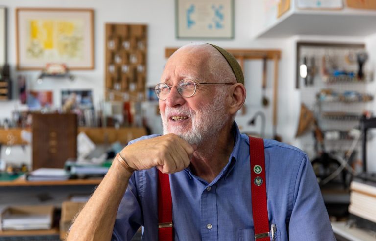
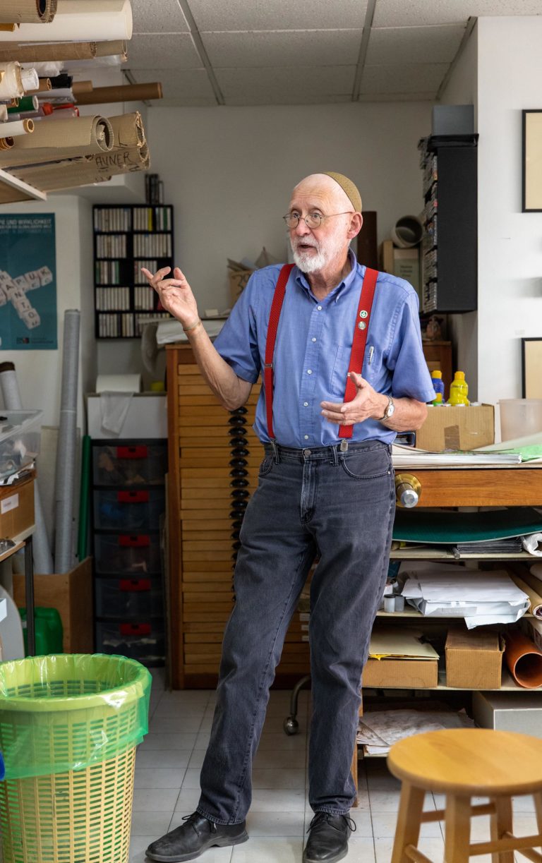
Yehuda Miklaf, born 1942, Esperanto advocate, Freemason, bookbinder and letterpress printer.
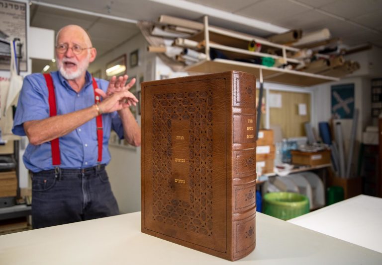
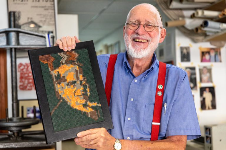
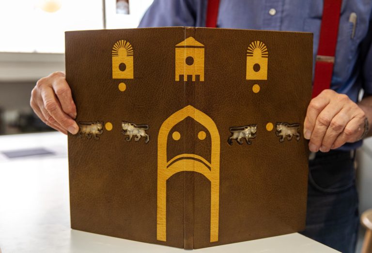
Joyous, enthusiastic Yehuda Miklaf hails from tiny, but historic, Annapolis Royal in Nova Scotia. His gravity-defying life path took him from Canada to a Franciscan seminary in New York City to, after converting to Judaism, his own bookbinding studio in Jerusalem. He has made bindings for the Pope, an American President, a French President and the Queen of England, among others. As his wife says, “Doors don’t open for Yehuda, they fall off their hinges.”1Yehuda Miklaf in an interview with Zachy Farber-Hennessey for Israel Underground.
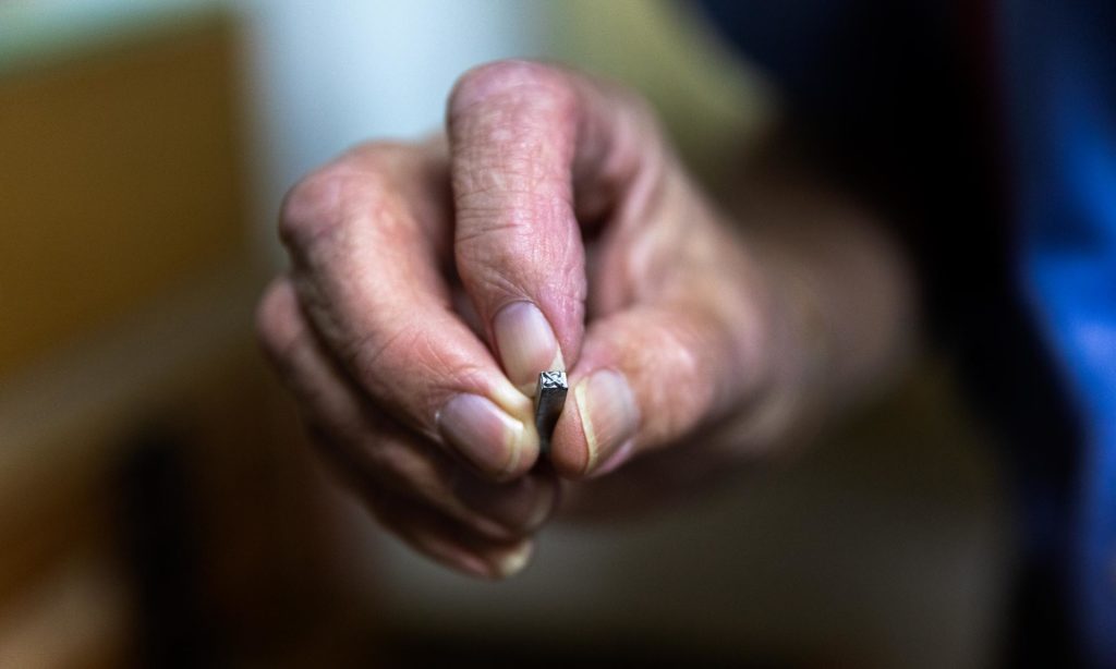
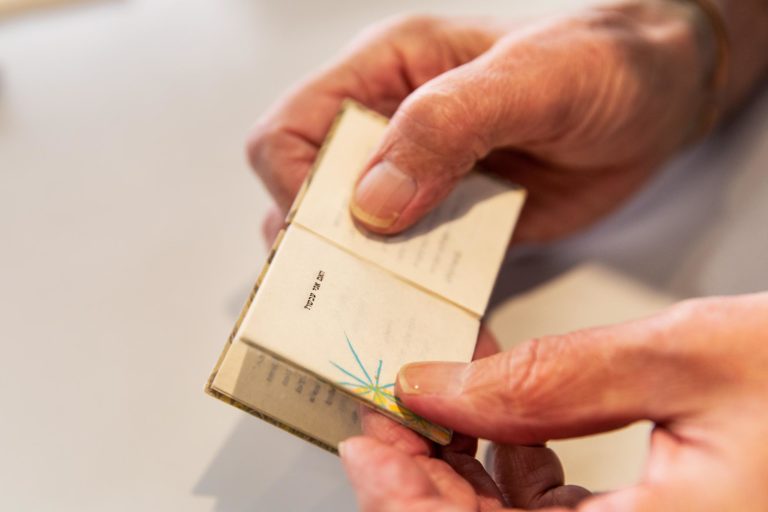
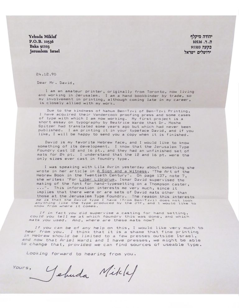
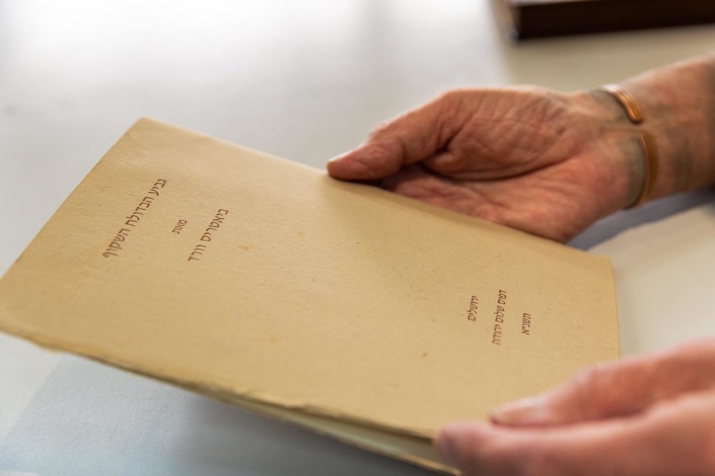
In the late eighties, fine printing began to absorb more of Miklaf’s attention and he established his own Shalom Yehuda Press with a small platen press and a Vandercook SP-15. Lili Wronker gave him the David Hebrew metal type that had been cast for Liber Librorum. In December of 1990, he wrote to Ismar David to inquire about the provenance of some Hebrew metal type.
24.12.90
Dear Mr David,I am an amateur printer, originally from Toronto, now living and working in Jerusalem. I am a hand bookbinder by trade, so my involvement in printing, although coming late in my career is closely allied with my work.
Due to the kindness of Nahum Ben-Tzvi of Ben-Tzvi Printing, I have acquired their Vanderook proofing press and some cases of type with which I am now working. My first project is a short essay on typography by Beatrice Warde that Dr. Moshe Spitzer had translated some years ago but which had never been published. I am printing it in your typeface David, and if you like, I will be happy to send you a copy when it is finished.
David is my favorite Hebrew face, and I would like to know something of its development. I know that the Jerusalem Type Foundry cast 12 and 16 pt., and they had an unfinished set of mats for 24 pt. I understand that the 12 and 16 pt. were the only sizes ever cast in foundry type.
I was speaking with Lila Avrin yesterday about something she wrote in her article in A Sign and a Witness, “ The Art of the Hebrew Book in the Twentieth Century.” On page 137, note 7, she writes: “For Liber Librorum, Ismar David supervised the making of the font for hand-typesetting on a Thompson caster,…”. This information interests me very much since it implies that there were or are sets of David mats other than those at the Jerusalem Type Foundry. The reason this interests me is that the David type I have (from Ben-Tzvi) does not look anything like the type produced by the JTF, and I would like to know from where it comes.
If in fact you did supervise a casting for hand setting, could you tell me at which foundry this was done, and which mats you used. And, where are these mats now?
If you can be of any help on this, I would like very much to hear from you. I think that it is a shame that fine printing in Hebrew should be limited to a few presses outside of Israel, and now that Ariel Wardi and I have presses, we might be able to change that, provided we can find sources of useable type.
Looking forward to hearing from you.
Yours,
Yehuda Miklaf
January 10, 1991
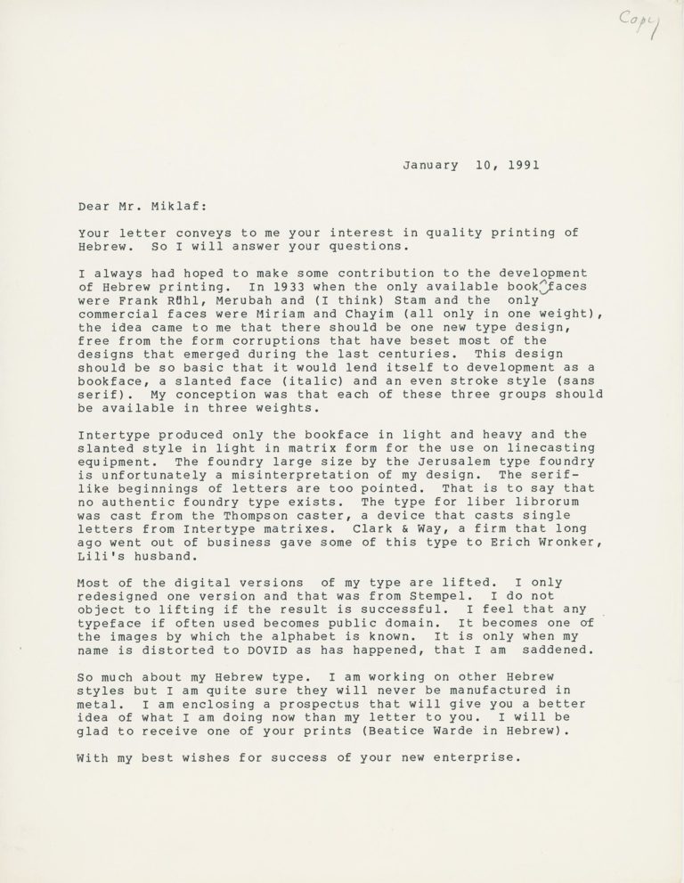
Dear Mr. Miklaf,Intertype produced only the book face in light and heavy and the slanted style in light in matrix form for the use on line casting equipment. The foundry large size by the Jerusalem Type Foundry is unfortunately a misinterpretation of my design. The serif-like beginnings of letters are too pointed. That is to say that no authentic foundry type exists. The type for Liber Librorum was cast from the Thompson caster, a device that casts single letters from Intertype matrices. Clark & Way, a firm that long ago went out of business, gave some of this type to Erich Wronker, Lili’s husband.
Most of the digital versions of my type are lifted. I only redesigned one version and that was from Stempel. I do not object to lifting if the result is successful. I feel that any typeface if often used becomes public domain. It becomes one of the images by which the alphabet is known. It is only when my name is distorted to DOVID, as has happened, that I am saddened.
So much about my Hebrew type. I am working on other Hebrew styles but I am quite sure they will never be manufactured in metal. I am enclosing a prospectus that will give you a better idea of what I am doing now than my letter to you. I will be glad to receive one of your prints (Beatrice Ward in Hebrew).
With my best wishes for success of your new enterprise.
[Ismar David]


