Moshe Spitzer, 1900–1982, Israeli publisher and typographer.
Moshe (Moritz) Spitzer was 16 years old when he wrote to Martin Buber for advice about organizing Zionist school groups in Austria. Sixteen years later, Spitzer became Buber’s scientific secretary, responsible for checking texts and assisting in various projects. In between, he served in the armed forces in World War I, studied at the University of Vienna, earned a Ph.D. in Indian Studies from Kiel University and worked as an assistant at the Preußische Akademie der Wissenschaften, where he became the first to work on the oldest surviving philosophical manuscript in Sanskrit, which now bears his name. (Comprised of 1000 fragments of varying sizes, the “the Spitzer manuscript” was lost during the Second World War and only survives through copies made by Spitzer in 1927–28.) As chief editor of Schocken Verlag from 1934–1938, Spitzer learned much about composition and production at the very highest standard and even designed books. He encouraged Schocken to publish Franz Kafka’s works. At the same time he planned his own timely exit from Germany, Spitzer devised a plan to rescue “the vast majority” of Schocken’s publications and ship them to Palestine.1Karpel, Dalia, The Enigmatic Life of a Hebrew Graphic Design Pioneer.Haaretz, October 29, 2016. The books and he arrived in Jerusalem in the autumn of 1939.
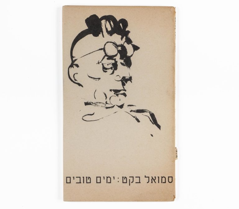
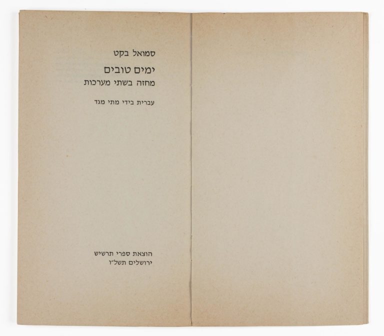
In 1940, Spitzer founded Tarshish Books, which for the next forty years would produce many of the finest and most beautiful books in the country, and designed many of the books himself. He discovered and promoted countless authors and artists. Beginning in 1942, Tarshish had its own typesetting shop and with partner Heinz van Cleef, Spitzer established the Jerusalem Type Foundry, the first type foundry in Israel. The foundry cast revivals and new modern faces, including Romema, Rahat and Hatzvi. After Intertype issued David Hebrew for line casting in 1954, Jerusalem Type Foundry cast it as a larger size foundry type, which Ismar David considered “unfortunately a misinterpretation of my design. The serif-like beginning of letters are too pointed.”2David, Ismar, letter to Yehudah Miklaf, January 10, 1991.
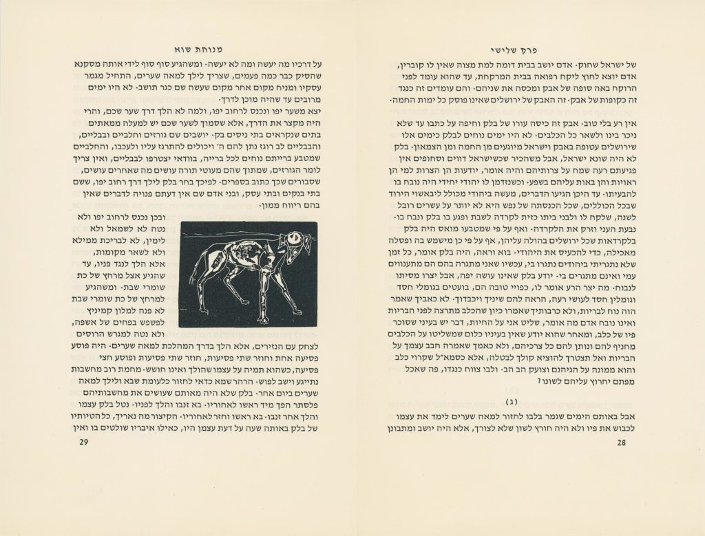
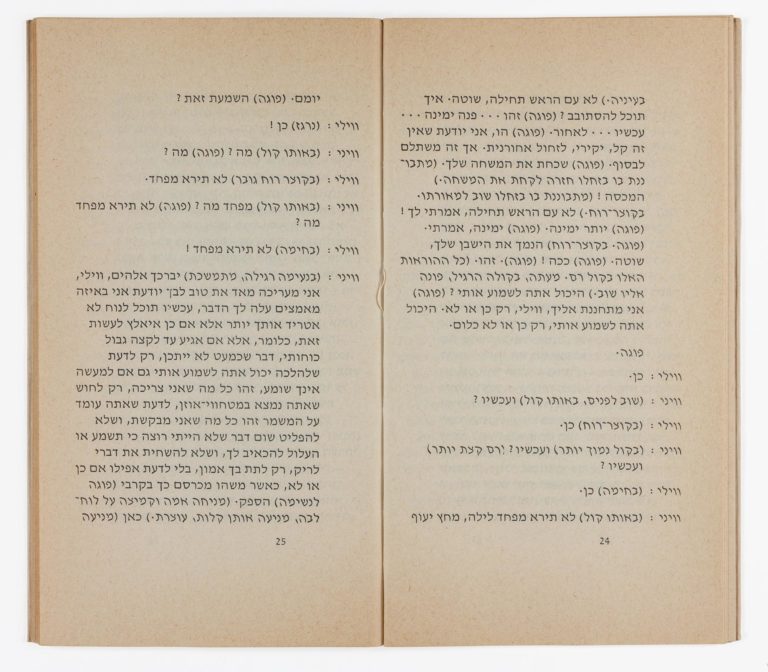
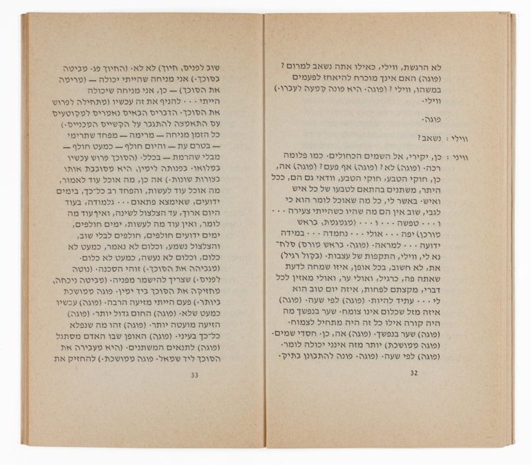
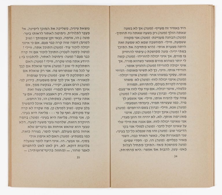
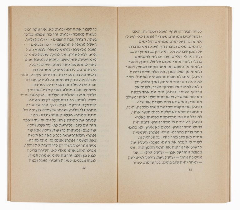
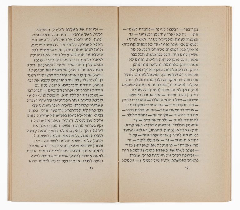
Spitzer had been more than aware of David and his work. As early as 1938, David had made a presentation folder of his concept for multi-font Hebrew typeface family and given it to Spitzer. Spitzer described the final design of David Hebrew as a “radical departure from the later traditional shapes of Ashkenazic as well as Sephardic letters, and a return to the genuine basic letter forms that anteceded excessive analogization. … The modeling of the strokes and their relations to the counters are of great beauty, and the appearance of a page set in this letter (I refer to the light face, of course) is at agreeable variance with that of the usual Hebrew book page, yet not at all strange. My share in the creation of this letter was confined to advice on desirable basic letter shapes and some details. It had its first test as a book face in my edition of S. Y. Agnon’s story “The Stray Dog,” illustrated by Avigdor Arikha (1960), and passed it very well.3Spitzer, Moshe, The Development of Hebrew Lettering. Off print from ARIEL, a Review of Arts and Letters in Israel, no. 37, 1974. Jerusalem: Cultural Scientific Relations Division, Ministry of Foreign Affairs, p. 27.
Ismar David designed a cover for Palestine Stories, for Tarshish in 1942.


