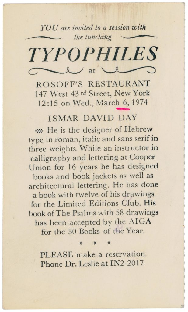
From drafts of a talk, given by Ismar David, at the March 6, 1974 Typophiles luncheon at Rosioff’s Restaurant on West 43rd Street in Manhattan.
Dear friends,I am grateful for the honor. I want to use this opportunity to elaborate some more on one of my latest works, The Psalms. The Hebrew typeface and the specific kind of drawings are the two aspects that have involved me a great deal. The Hebrew developed in a time when only a few Hebrew typefaces were available.
When I could not resist the temptation to venture into Hebrew type design, it was clear to me that these new designs would have to move much closer toward their Middle Eastern ancestors and away from those styles that had developed in Europe.
The impact and impression that new surroundings, the Judean landscape, the eastern way of life and a new social environment had made precluded any other conception. But, of course, all technical aspects had to be considered within the framework of western achievements in typographical design. I intended to go one step further than in the conception of a type family and add a sans serif to text face and oblique and I developed these three variations on three weights. Each letter of theses nine variation would fit on the same matrix and line up in print on the same base line. This is always a problem that goes with designs intended for line casting machines. In those days no one in Palestine thought of anything else. I had to come to grips also with proportions of letters and devised a division of the alphabet into three groups, just one group narrow letters, then the group of medium width that included all letters with only one vertical element with the and [a] very few others and the third wide group including most letters with two full vertical elements or more. This system brought a much higher degree of evenness in structure and texture than is usual in Hebrew typography, which too often suffers from spottiness.
The new forms, which I developed, I tried out in newspaper ads, as display matter and on sign boards, of which I designed many during this period. I gained confidence as I observed the acceptance that was given to these new forms. After about 15 years since my start I finally prepared final drawings for Intertype. Unfortunately the three sans serif designs were not included in Intertype plans. Since then the accepted deigns for the text face and its oblique companion have gained wide acceptance. While in the beginning, their use was limited to commercial matters, more and more books are now set in these faces and it does not any longer seem strange to see a book like The Psalms set in my Hebrew.
That much about type. Now about my drawings.
While I admire western art I am drawn toward the Oriental concept that uses symbols but never tries to imitate nature or to create illusions of realities. But these symbols are rendered so that they not only stand for objects, but convey qualities of it as well as a mood and atmosphere. There is a great difference between the simplistic symbol like the red cross which you can only recognize for what it is after you have learned its meaning and the brush delineation of a blossom on a Chinese screen that can convey so much beyond the form which it symbolizes. In my work, lines do not any longer define shapes, but become symbols like letterforms, being straight or curved and modulated. They are grouped to form patterns to suggest and stimulate, but never to define. A lot is left to the viewer. Specifically for drawing s that are accompanying religious texts , it seems to me important that the views is not irritated by the style of attire of figures, the fashion of beards or hair styles, but is allowed to let his imagination wander.
Of course, I also like to use color. But here, too, I will not use color in a realistic fashion. Color can create texture and background. It can create tension. And if used successfully, it will complement or support my lines and strengthen their impact. So I use lines and color, but mainly lines, not in the framework of isms, like realism, expressionism or impressionism, but to serve my own needs to communicate my ideas [and] my feelings, but in the service of the book.


